What is shape language in character design?
Shape language in character design is the deliberate use of forms, proportions and repeating contours to communicate a character’s identity. Circles can suggest softness, squares can suggest solidity, and triangles can introduce direction or tension. These are visual associations, not universal rules: expression, pose, costume, colour and story can reinforce or overturn them.
A memorable character needs more than an appealing face. Its outline should be recognisable, its parts should belong together, and its design should survive movement. This guide explains how to make those decisions, with licensed Blender Foundation artwork for visual study and an original design exercise you can apply to a film, game or brand mascot. The artwork is credited to its creators and is not presented as Mimic Cartoon production work.
In this guide
Circles, squares and triangles: a useful starting point
Think of a shape family as a starting direction for the whole design. A circular head with a broad rectangular body tells a different story from the same head balanced on a narrow, tapering torso. Read the large masses first; tiny costume details should not have to explain an unclear design.
Circles and ovals: continuity and softness
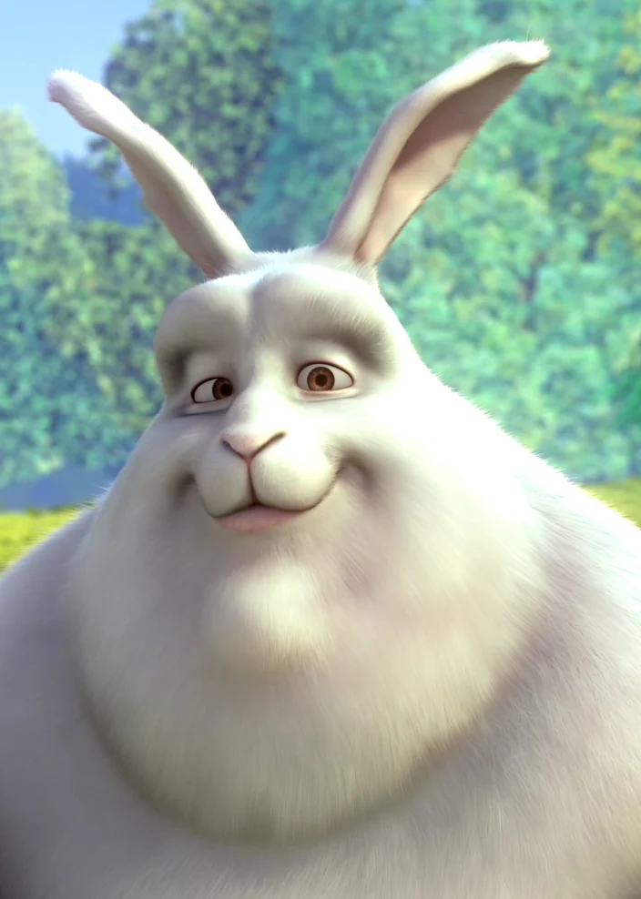
Curved contours move the eye without abrupt changes of direction. Rounded cheeks, an oval torso and soft hands can support an approachable impression. In the Bunny portrait above, the cheeks, muzzle and head create a repeated family of curves. That repetition gives the design cohesion without turning every feature into the same circle.
Round does not automatically mean harmless. A rounded character can be intimidating through size, posture or performance. When designing a gentle giant, for example, a broad curved torso may supply both warmth and physical weight. Check whether the expression and behaviour agree with the first impression you want.
Squares and rectangles: weight and structure
Broad shoulders, a flatter jaw, a boxy torso and sturdy feet can create a grounded, constructed feeling. Rectangles are also useful when designing uniforms, armour and equipment. Their effect changes with proportion: a tall narrow rectangle feels different from a low, wide block.
A dependable guide might combine a rectangular coat with softer facial features. A rigid administrator could repeat straighter edges through the shoulders, collar and posture. Neither interpretation is guaranteed by geometry alone; the surrounding design and the audience’s context still matter.
Triangles and tapered forms: direction and contrast
Points and diagonals lead attention. A tapered body, swept hairstyle, pointed ears or an angled coat can introduce a feeling of speed or alertness. They can also make a silhouette more distinctive. Use them selectively: if every feature points somewhere different, the design may feel busy rather than energetic.
Triangles are not reserved for villains. A brave explorer can have angular boots and a pointed scarf; a comic antagonist can be almost entirely round. The Walt Disney Family Museum’s shape-language lesson discusses these associations while explaining that designers can contradict them. Treat familiar associations as choices to test, not personality diagnoses.
Shape language also differs from rendering style. A character can retain its underlying geometry in a flat drawing, a stop-motion puppet or a polished 3D model. Our guide to types of cartoon styles explores that wider visual context.
Combine shapes to create a specific personality
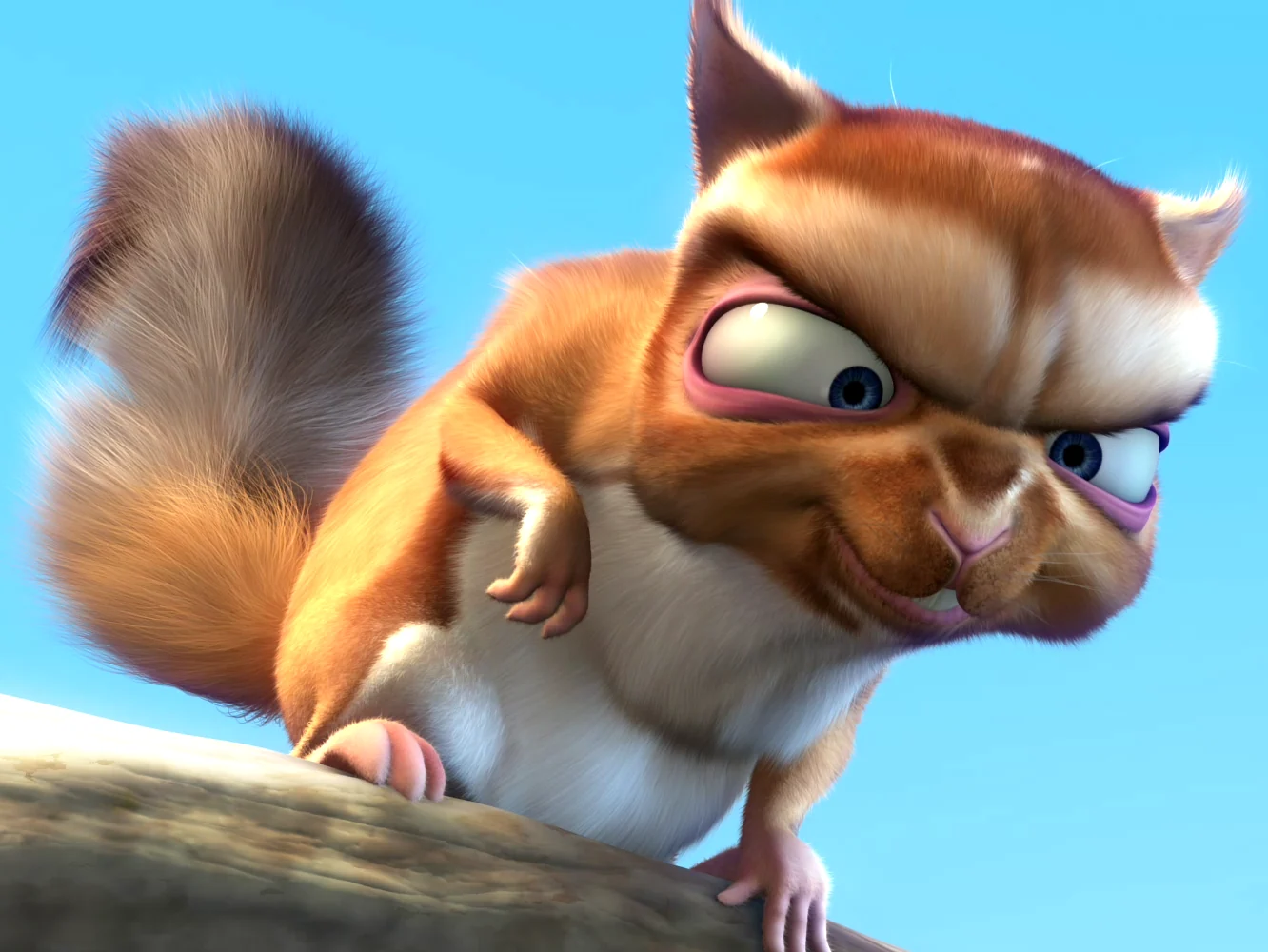
The strongest designs usually establish a dominant form and then introduce controlled contrast. In the Frank example, the pointed ears and facial angles sit against softer fur and rounded volumes. Notice the relationships between forms rather than trying to label the entire character with one geometric symbol.
Build a hierarchy from large to small
Start with the head, torso and overall stance. These primary masses should carry the clearest idea. Then organise secondary forms such as hair, limbs and clothing. Finally add smaller accents: buttons, brows, fingers and accessories. If the small details compete with the main outline, simplify them before adding more polish.
There is no mandatory percentage of circles or triangles. Instead, decide what should dominate at thumbnail size. A round-bodied inventor with square glasses and a narrow pointed tool bag can remain cohesive because each contrasting feature has a job. Repeating the bag’s angle in one small costume accent may connect it to the design; repeating it everywhere could erase the intended softness.
Design the cast together
Characters are often seen beside one another. Compare their heights, head-to-body ratios, shoulder widths and resting poses on the same page. Three individually appealing designs can still become hard to distinguish if their overall masses are nearly identical.
Give each cast member a clear difference that survives a change of outfit. One could have a low centre of mass, another a long upright silhouette, and another a compact torso with a wide head. Their shared world can come from consistent facial construction, material treatment and detail density. Difference gives recognition; consistency makes the cast belong together.
Let the story complicate the first impression
A welcoming exterior paired with suspicious behaviour can create tension. A visually imposing character who moves carefully around smaller companions can become endearing. Shape language sets up an expectation; acting decides what the audience learns next.
Write the character’s motivation before settling on the final design. “A protective courier who is afraid of being late” gives you more useful decisions than “a friendly triangle character.” For a broader foundation, connect this exercise to character development in animation and the principles behind effective cartoon character design.
A practical shape-language workflow
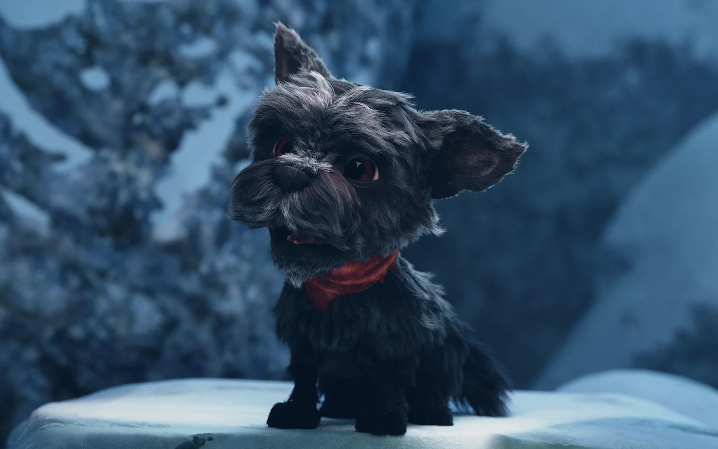
The Autumn render above offers a useful observation exercise: trace the outer contour mentally, then notice how the ears, muzzle, body and legs break that contour into readable parts. You do not need to reproduce an existing character to learn from those relationships. Apply the following process to your own brief.
1. Define the impression and the action
Write a one-sentence role, three intended qualities and one action the character must perform. For example: “A dependable delivery robot that welcomes customers, carries fragile parcels and squeezes through small doorways.” This is a hypothetical design exercise, not a description of an existing client project.
Now turn the brief into questions. Should it feel soft enough to approach? Does its base look stable when carrying a parcel? Will its arms remain visible beside its body? A clear animation brief makes these choices easier to evaluate.
2. Explore different masses before details
Draw several small versions using only the head, body and limbs. Try a round shell on a wide base, a rectangular body with curved corners, and a tapered torso with large hands. Keep the same task in mind while changing the structure. Avoid choosing solely because one sketch has a charming facial expression.
At this stage, work quickly enough that you can discard an idea. A polished sketch can make an unresolved design feel more finished than it is. The goal is to compare alternatives, not to decorate the first acceptable version.
3. Test the silhouette and negative space
Reduce each option to a solid silhouette. Check it at the size it will actually appear: a mobile game character may be much smaller than a film close-up. Can you separate the head from the shoulders? Do the hands disappear against the torso? Is the gap between the legs readable?
Test more than a neutral pose. Ask the robot to carry a parcel, wave and crouch. A silhouette that only works in a presentation pose is not yet ready for animation. Change the proportions or pose spacing where necessary; do not assume bright colours will solve every overlap.
4. Ask viewers what they actually see
Show a few alternatives without explaining the intended answer. Ask which feels most approachable, which looks able to carry weight, and which seems easiest to recognise later. Avoid leading questions such as “Does this rounded version look friendly?”
A small review provides qualitative feedback, not proof of a universal response. If the viewers disagree, investigate the feature they are responding to. The eyes, stance or colour may be overpowering the underlying shapes. Refine the design against the brief rather than averaging every preference.
5. Record the decisions that must survive
Document the signature proportions and the acceptable range of variation. Note the width of the base, the relationship between head and torso, and any feature that should stay visible in key poses. Explain the reason behind each decision. These notes are more useful to another artist than a rule that simply says “make it appealing.”
For the rest of the process—from initial concepts to expressions and presentation—see our cartoon character design guide. Shape exploration should strengthen that workflow rather than become a separate exercise with no production handoff.
Keep the design readable in 3D and animation
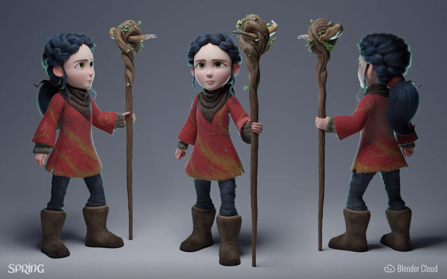
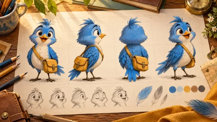
The Spring turnaround above shows why a strong front view is only part of the job. A 3D character must retain its identity as the camera and pose change. The visible outline changes continuously, while the audience should still recognise the same person.
Translate shapes into volumes
A circle on paper might become a sphere, an egg-shaped head or a flattened cheek plane. A triangle might become a tapered torso, a wedge-shaped nose or a broad shoulder mass narrowing toward the waist. Choose the volume that preserves the intended contour from the important viewing angles.
Compare the front, side and three-quarter views early. An appealing wide face can become too flat in profile; a dramatic nose can hide the far eye. A character turnaround sheet helps communicate those relationships before detailed modelling begins.
Protect the signature forms during movement
Test the character in the actions the brief requires. Deep bends, wide smiles and raised arms can distort the forms that made the design distinctive. Review where volume should be preserved and where exaggeration supports the performance. The answer depends on the intended style, not a single technical rule.
Discuss these tests during character rigging, while adjustments are still manageable. A flexible control system is valuable only if the animator can reach the intended poses without losing the character’s identity.
Common mistakes to catch before approval
Conflicting shape families: every accessory introduces a new visual direction. Remove or connect the accents that distract from the main idea.
Detail replacing structure: textures and costume decorations carry the appeal while the basic masses remain unclear. Review the character without them.
One-view design: the front view works but the profile and action poses collapse. Review those views before approving final proportions.
Identical cast silhouettes: clothing changes, but body shapes do not. Compare the whole cast at a small scale.
Rigid personality formulas: the design follows a geometric stereotype instead of the story. Return to the character’s role, contradictions and required actions.
Before approval, ask whether someone can recognise the character in a plain silhouette, a moving shot and a small thumbnail. You are looking for consistency across useful conditions, not perfection in a single beauty render.
Frequently asked questions
What is shape language in character design?
It is the deliberate use of shapes, proportions and recurring contours to communicate a character’s identity and support readability. It works alongside pose, expression, colour, costume and storytelling.
What are the three basic shapes used in character design?
Circles, squares and triangles are common starting points, including related forms such as ovals, rectangles and tapered shapes. Most finished characters combine several forms rather than following only one.
Do circles always make a character look friendly?
No. Curves can suggest softness, but scale, facial expression, movement and context can change the impression. A rounded character can be threatening, and an angular character can be kind.
What is the difference between shape language and silhouette?
Shape language includes the relationships between all the character’s forms, including internal features. A silhouette is the outer contour shown as one solid shape. Testing the silhouette helps reveal whether the design reads clearly.
Can one character use circles, squares and triangles?
Yes. Choose a dominant structure, then use contrasting forms purposefully. A broad rectangular body with rounded facial features can combine a sense of weight with a softer expression.
How do I practise shape language as a beginner?
Choose a simple character brief and draw several small alternatives using different head and body masses. Compare their silhouettes in three poses, then ask viewers what each suggests without explaining your intention first.
Does shape language matter for realistic characters?
Yes. The treatment may be subtler, but proportion, posture, facial planes and costume still organise the design. Avoid treating a person’s physical features as evidence of moral character or personality.
How do you preserve shape language in 3D?
Translate the key shapes into volumes, compare front and side views, and test important poses early. Document the signature proportions so modelling, rigging and animation decisions reinforce the same design.
Conclusion: make the shape serve the character
Effective shape language gives a character a clear first impression and a consistent visual identity. Start with the story, establish a readable hierarchy, introduce contrast deliberately, and test the design at the size and in the poses your audience will see. The best result is not a character that obeys a geometry formula; it is one whose design supports its role.
Mimic Cartoon develops character-led animation from concept through production. Explore our character design and animation services, or share your character brief with the team. Bring your audience, intended platform, visual references and key actions so the conversation starts with what your character needs to do.
Put the guide into practice
Developing a character for a film, game or brand? Share the audience, personality, visual references and actions your character needs to perform.
Discuss your characterImage credits and licences
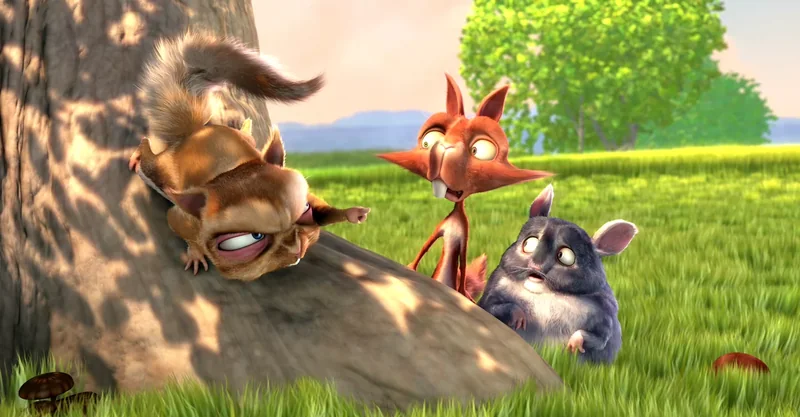
Three woodland characters from Big Buck Bunny with contrasting proportions and facial shapes — (c) copyright Blender Foundation | www.bigbuckbunny.org · CC BY 3.0. Resized and converted to WebP.
Bunny portrait showing repeated rounded forms in the cheeks, muzzle and head — (c) copyright Blender Foundation | www.bigbuckbunny.org · CC BY 3.0. Resized and converted to WebP.
Frank from Big Buck Bunny with pointed ears, angled brows and a curved tail — (c) copyright Blender Foundation | www.bigbuckbunny.org · CC BY 3.0. Resized and converted to WebP.
Autumn from Spring, showing distinctive ears, muzzle and compact body proportions — Andy Goralczyk / Blender Foundation · CC BY 4.0. Resized and converted to WebP.
Spring character turnaround with front, three-quarter and back views — Julien Kaspar / Blender Foundation · CC BY 4.0. Resized and converted to WebP.